

THE LANDING
Design
2018
A rebrand of the winery including wine labels.
TERRA
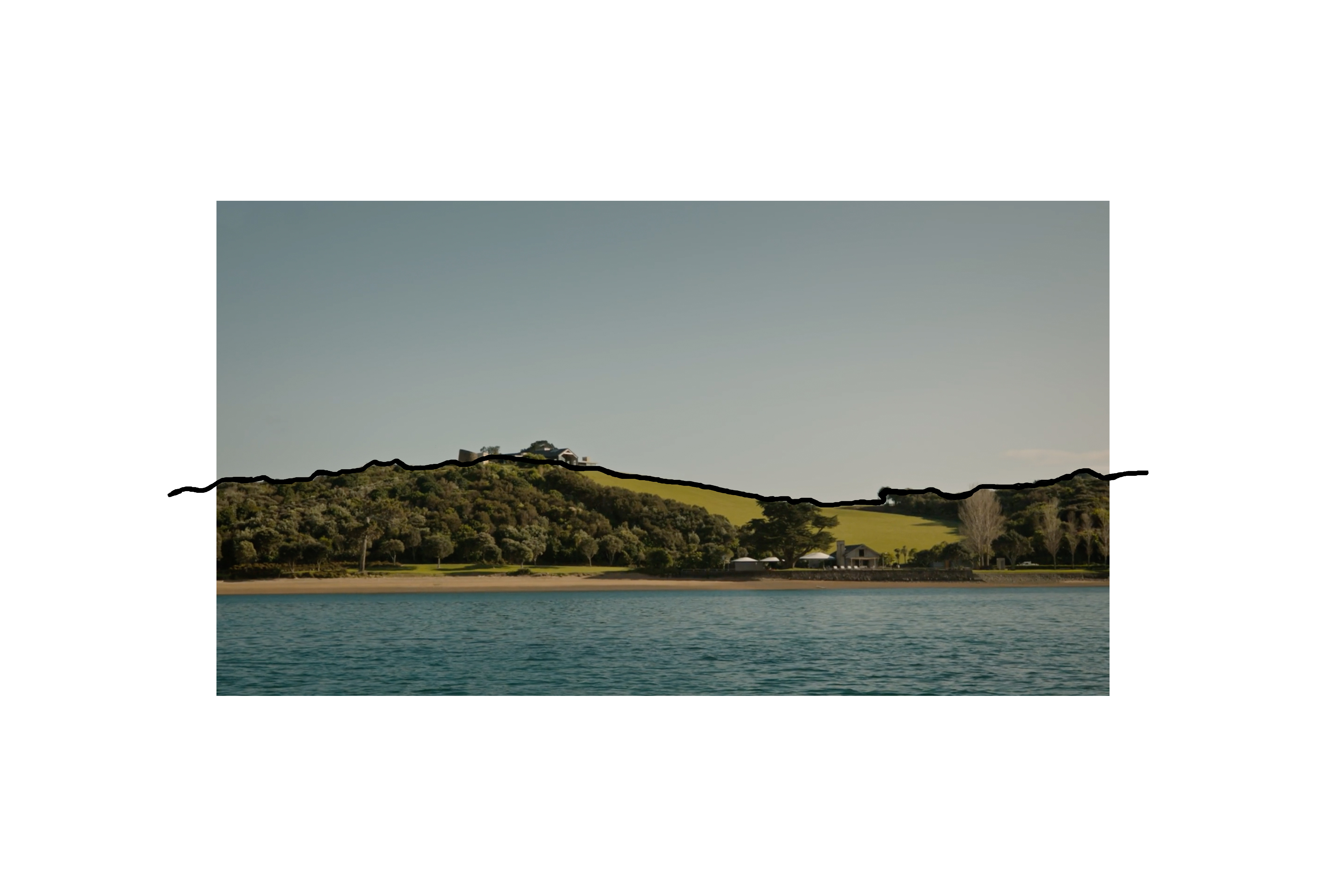
The unusual physical location of The Landing’s vineyard is central to this concept:
Undulating landscape within a protected rain shadow, sheltered between higher points, this has been an area treasured throughout history for its richness and one that is now producing award-winning wine. These hills forms the top edge of the label.
This concept speaks to the stories of that land. The bold cross references the physical crossed tracks that can be seen on a hill at The Landing, which mark the literal paths home, and figurative crossing of cultures, between Maori and Pakeha.
This concept was not actioned.